Mastering the Art of Color:
Focusing on Mood and Lighting

Selecting the perfect paint color for a client’s space isn’t simply about choosing an attractive shade—it’s about establishing the right mood, harmonizing design elements, and creating a cohesive look.
Whether you’re an experienced decorator or just starting out, confidently guiding your clients through the color selection process can enhance your services and set you apart.
In this blog, we’ll explore two essential factors: understanding the space’s purpose and mood, and taking into account both natural and artificial lighting.
Understanding the Space’s Purpose & Mood
Every room has its own unique function, and color plays a vital role in setting the overall atmosphere. The right color can transform a space into a tranquil retreat, a warm and inviting area, or an energizing workspace. When consulting with clients, ask them how they want to feel in the room—their responses will guide your color choices.
- Calm & Relaxed – Soft blues and greens, like Benjamin Moore’s Palladian Blue (HC-144) or October Mist (1495), create a serene, spa-like ambiance. These hues work beautifully in bedrooms and bathrooms where a peaceful environment is key.
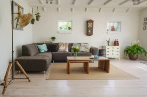
- Warm & Cozy – Earthy tones such as Shaker Beige (HC-45) or Lenox Tan (HC-44) offer a comforting, inviting feel, making them perfect for living rooms and dens. These colors blend well with natural textures like wood and stone.
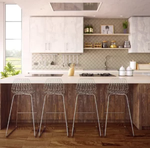
- Energizing & Productive – Brighter hues like Hawthorne Yellow (HC-4) or crisp whites such as Chantilly Lace (OC-65) add vitality to offices and kitchens. Yellows can stimulate creativity and focus, while clean whites create a fresh, airy space that boosts productivity.
To support these color choices, consider the psychological effects of different hues. Blues and greens are known for their calming properties, while reds and yellows tend to promote energy and excitement. Meanwhile, neutral tones offer flexibility and can be layered with bolder accents to suit various moods over time.

Considering Natural & Artificial Lighting
Lighting is often one of the most overlooked aspects of paint selection, yet it can dramatically alter the way a color appears. A paint sample that looks flawless under store lighting may look completely different once applied on a client’s wall. That’s why it’s crucial to assess how light interacts with the color before making a final decision.
- Rooms with Abundant Natural Light – Areas that receive plenty of daylight can handle darker hues without feeling confined. North-facing rooms often emphasize cooler undertones, while south-facing rooms tend to enhance the warmth of colors.
- Spaces with Minimal Light – In rooms with limited natural light, opting for lighter, warm-toned shades can prevent the space from feeling too cold or uninviting. Soft neutrals and warm whites reflect available light and help make the room feel more open.
- Artificial Lighting Impact – Various artificial light sources can noticeably affect how a paint color appears:
- LED Lighting – These lights are available in both warm and cool tones and can either accentuate warm undertones or create a modern, crisp effect.
- Warm White Bulbs – These bulbs emit a cozy glow that enriches warm colors while softening cooler hues.
- Daylight Bulbs – Mimicking natural light, daylight bulbs provide a balanced and true-to-life representation of a color, though they may sometimes make shades appear overly crisp.
- LED Lighting – These lights are available in both warm and cool tones and can either accentuate warm undertones or create a modern, crisp effect.
To ensure accuracy, always test your samples under the room’s actual lighting conditions. Apply paint swatches on various walls and observe them at different times of the day to avoid any unexpected surprises when the entire space is painted.
Mood and Lighting
Mood and lighting are among the most important factors when selecting the perfect paint color.
By understanding how a client wants their space to feel and recognizing how lighting affects the color, decorators can make informed recommendations that elevate the overall design. Benjamin Moore’s expansive color collection offers a wealth of options, making it easier to find the ideal shade for any project.
Taking the time to evaluate both mood and lighting will help you achieve a stunning, cohesive result—one that your clients will appreciate for years to come!
Learn About our Decorating & ReDesign Certification


FAQs About Mood and Lighting
Natural light can significantly alter the appearance of a color. In a room bathed in strong, direct sunlight, a color may look more vibrant and saturated, while softer, diffused light can soften the hue.
Additionally, the angle of the sunlight and the time of day are important factors—morning light often provides a warm glow, whereas afternoon light may cool the tone. Observing your space under different natural lighting conditions can help you understand the true essence of the color.
Begin by examining the room’s natural light sources. Take note of the window orientation and size, along with any architectural features that affect how light enters the space.
Observe how the light changes throughout the day—determine which areas receive the most sunlight and where shadows are cast. This thorough evaluation will help you anticipate how your chosen color will look at various times, ensuring a more harmonious outcome.
Various artificial light sources can subtly alter how a color appears. For instance, LED lights, which often come with adjustable settings, can either highlight warm undertones or make the color appear cooler, depending on the temperature.
Warm white bulbs emit a cozy, inviting glow that enhances earthy or neutral colors, while daylight bulbs—designed to mimic natural light—provide a more balanced and true-to-life depiction. Understanding these differences will help you choose a color that looks appealing under various lighting conditions.
One effective method is to apply small paint samples on several walls that experience different lighting conditions. Observe these samples at different times of the day—morning, afternoon, and evening—to see how they change under both natural and artificial light. This hands-on approach ensures you fully understand how the color behaves in your specific space, minimizing the risk of surprises when the room is fully painted.
In spaces with limited natural light, opting for lighter, warm-toned colors can help brighten the room and create a welcoming atmosphere. Lighter shades reflect more of the available light, making the area look larger and more open, while warm tones add a sense of coziness.
Additionally, consider using layered artificial lighting—such as ambient, task, and accent lighting—to further enhance the overall brightness and balance of the space.